
It started with a simple Google search: “Best wedding photographers near me.”
Awetu, recently engaged, excited and anxious, clicked on the first link that showed up.
The page loaded—slowly.
The layout was chaotic.
Pop-ups ambushed her like landmines.
The “Book Now” button was hidden beneath a clutter of banners.
Within 15 seconds, she hit the back button. That photographer lost not just a client—but a reputation.
Now scale that moment: 94% of users judge a brand based on its website. In a world where first impressions are now digital, one click can cost trust, traffic, or thousands in revenue.
At TechVoltMedia Solutions, we’ve seen the same fatal design sins repeat across industries, costing entrepreneurs, creators, and corporations their digital lifeline.
In 2025, web design is not just aesthetics—it’s psychology, performance, trust, and strategy.
Let’s uncover the 7 most dangerous web design mistakes haunting websites today—and exactly how to eliminate them like a pro.
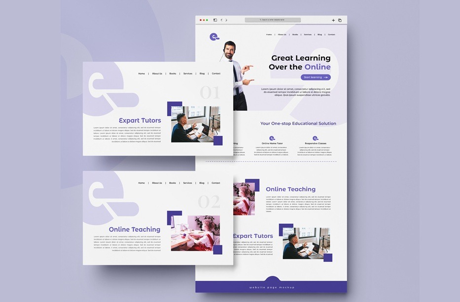
1. Design Without a Purpose (The Aesthetic Trap)
The Mistake:
Designing for beauty, not for business goals. Think sleek pages that look “modern” but confuse users.
The Emotional Fallout:
Visitors feel lost, frustrated, even tricked. There’s no clear path, no CTA, no message.
The Fix:
- Start with your goal: Is it to sell, subscribe, book, or inform?
- Use conversion-centered design—every element must guide users to that goal.
- Heatmap tools like Hotjar can reveal how users interact with your site and where they drop off.
💡 Pro Insight: A beautiful website that doesn’t convert is like a billboard in the desert.
2. Ignoring Mobile Users
The Mistake:
Still designing desktop-first in a mobile-first world.
The Emotional Fallout:
Imagine pinching, zooming, and squinting just to read a headline. Users bounce, frustrated.
The Fix:
- Embrace responsive, mobile-first design using CSS frameworks like Tailwind or Bootstrap.
- Test on multiple devices—real users don’t only use iPhones.
- Google’s Mobile-Friendly Test is your friend.
📱 Stat Check: Over 63% of web traffic in 2025 is mobile. Ignore that, and you’re invisible.
3. Loading Time Longer Than 3 Seconds
The Mistake:
Heavy graphics, bloated plugins, or unoptimized code dragging your load speed.
The Emotional Fallout:
Today’s users want it fast. Every second of delay = higher bounce rates and lost revenue.
The Fix:
- Compress images (use WebP format).
- Enable lazy loading.
- Host with performance-optimized providers like Cloudways or Bunny.net.
- Audit regularly with Google PageSpeed Insights or GTMetrix.
🕒 Real Talk: 40% of visitors abandon a site that takes more than 3 seconds to load.
4. Cluttered Layouts and Poor Hierarchy
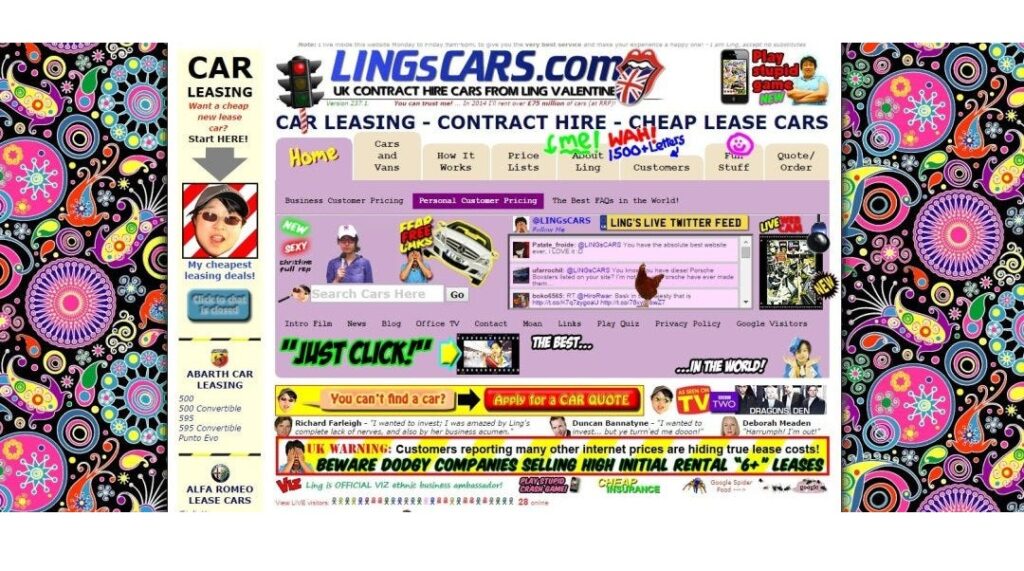
The Mistake:
Trying to say everything at once. Users get overwhelmed by too many fonts, buttons, and distractions.
The Emotional Fallout:
Users feel overwhelmed. They freeze or flee.
The Fix:
- Apply the F-pattern or Z-pattern to guide eye flow.
- Use whitespace. It’s not “empty”—it’s clarity.
- Prioritize visual hierarchy with size, color, and position.
✨ UX Rule: If everything is important, nothing is.
5. Weak Call-To-Actions (CTAs)
The Mistake:
Generic CTAs like “Click here” or “Submit” that don’t spark action or emotion.
The Emotional Fallout:
Users hesitate. They’re not sure what happens next or why it matters.
The Fix:
- Make CTAs action-driven and benefit-focused. Example: “Get My Free Strategy Guide” vs. “Download”.
- Use contrasting colors.
- Place CTAs above the fold and at logical scroll points.
🎯 Expert Tip: The CTA is your digital handshake—make it confident and clear.
6. No Accessibility Considerations
The Mistake:
Overlooking users with disabilities—color blindness, low vision, cognitive issues, etc.
The Emotional Fallout:
They feel excluded. You lose trust—and possibly face legal risks.
The Fix:
- Follow WCAG 2.2 standards.
- Use alt text for all images.
- Ensure color contrast and enable keyboard navigation.
- Use tools like axe DevTools or WAVE to test accessibility.
Inclusive Wins: Accessible websites reach more people and build stronger brand reputation.
7. Static, Unchanging Content
The Mistake:
Building a site and never updating it. Outdated blogs. Broken links. Dead offers.
The Emotional Fallout:
Visitors assume your brand is inactive or irrelevant.
The Fix:
- Use a content calendar to regularly refresh content.
- Maintain a dynamic homepage with updates, testimonials, or offers.
- Enable easy CMS integration (e.g., WordPress, Webflow) for agile content management.
Growth Hack: A living website attracts repeat visits and SEO love.
The Click That Cost Everything
Your website is more than a digital brochure—it’s your story, storefront, and first impression.
When it fails, you’re not just losing clicks.
You’re losing trust, revenue, brand equity, and future opportunities.
And worst of all? You might not even know it.
That silent failure—that’s the heartbreak we help brands overcome at TechVoltMedia Solutions.
What This Means for You and Your Brand
In 2025, web design is digital trust engineering.
It’s the difference between a visitor and a loyal client. Between bouncing off and buying in.
The good news? Every mistake we covered is fixable—with the right mindset, strategy, and guidance.
At TechVoltMedia Solutions, we’ve spent decades perfecting digital environments that don’t just look good—but work hard.
We blend SEO mastery, UI/UX psychology, brand storytelling, and strategic content to ensure your website becomes your most powerful business tool.
Key Takeaways
- Design for purpose, not prettiness.
- Think mobile-first and speed-optimized.
- Clarity, accessibility, and dynamic content win in 2025.
- Your CTA is your conversion engine—make it count.
Ready to Fix Your Website?
Don’t just patch problems—elevate your digital presence.
Let’s review your site together and create a future-proof strategy that aligns with your brand goals.
Book a free Website Diagnostic Session with TVM-Solutions today.
Your message has been sent
In today’s digital world, you don’t just need a website—you need a winning experience.